.png)
I started by mapping out the current navigation of the Help Center
.png)
Looked at previous insights surrounding the Help Center and Community forums

Made assumptions to test


Conducting the usability study
Objectives:
- Identify common usability issues within the Help Center UX.
- Uncover inconsistencies and inefficiencies in visual navigation.
- Gain insights into customer behavior when searching for content.
- Understand distinctions in user interaction between mobile and desktop platforms.
- Compile a participant list for testing, comprising a mix of new and returning users.
- Analyse top visited articles and their bounce rates in Google Analytics to assess the accessibility of desired information for customers.


Summary of study findings
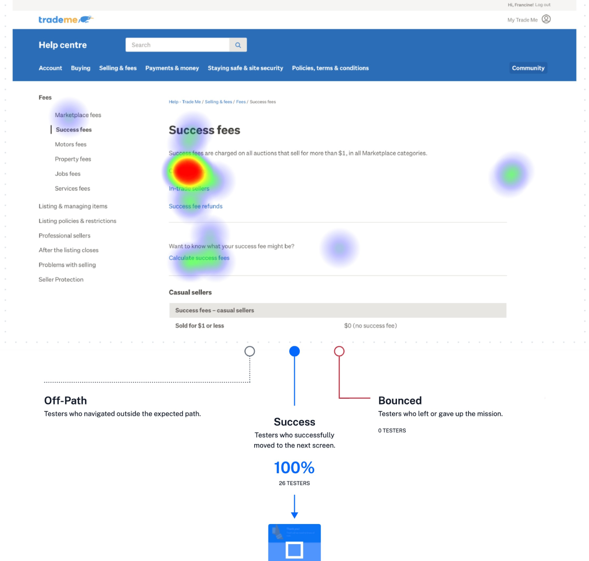
- 23/43 participants successfully navigated to the success fees page.
- The home page has a bad usability score of 43/100.
- The time taken to navigate through the entire task of navigating to the success fees help article on the Trade Me Help center was extremely long on avg. at 36.3 seconds.
- The majority of participants felt they navigated to the correct place to learn about success fees, however 10 of the 39 participants did not click through to the success fees page, compared to 29 participants who said yes and correctly navigated to the success fees page.
- Of the testers that answered Yes but hadn’t navigated to the correct place, 5 of them claimed to visit the help center once or twice a month and only 2 participants had never visited the help center.
- Of the 29 participants who correctly navigated to the success fees page, 19 visited the help center once or twice a month, 8 had never visited and 3 claimed to visit once or twice a week.
-There seems no correlation between being familiar with the Help Center and not in the success rate of navigating the Help Center.
- The blank looking fees landing page has a long view time on average of 13 seconds and a maximum view time by 1 participant at 22 seconds. However only 3 of the 43 participants navigated via that path.
-Top requests for improvements are larger font size and more visual cues
Suggested improvements
.png)
.png)


